Notification Feature
UX PROJECT
From August to end October I work as a UX design intern for a startup that builds mobile robots for vertical farming. My main role is to work on the development of the operating system for the robots.
Goal
In this project, the goal is to design the user experience of receiving notifications for the vertical farms. The scope in the project includes designing the information architecture, the messaging hierarchy for different channels, and designing the user interface. The project team also includes a web developer, who will be implementing the final solution in the operating system.
In the beginning of the project, I am given the already established requirements, and based on these I come up with 4 “How Might We” statements, that will guide our way for the project.
- How might we reduce downtime by alerting operators to robot errors quickly?
- How might we build trust in the mobile robot solution – “I will be told if something is wrong”
- How might we provide functionality that meets the specific needs and preferences of the vertical farm
- How might we build a foundational feature platform for further development with more data offerings, e.g. notifications about computer vision alerts
Project Management
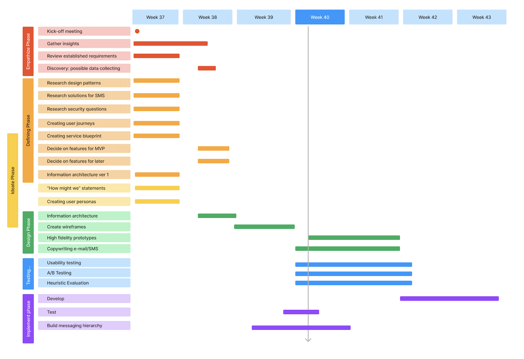
Empathizing

During the kick-off meeting, we have already established which kind of people will be using the operative system. I create these user personas to be used further in the project.
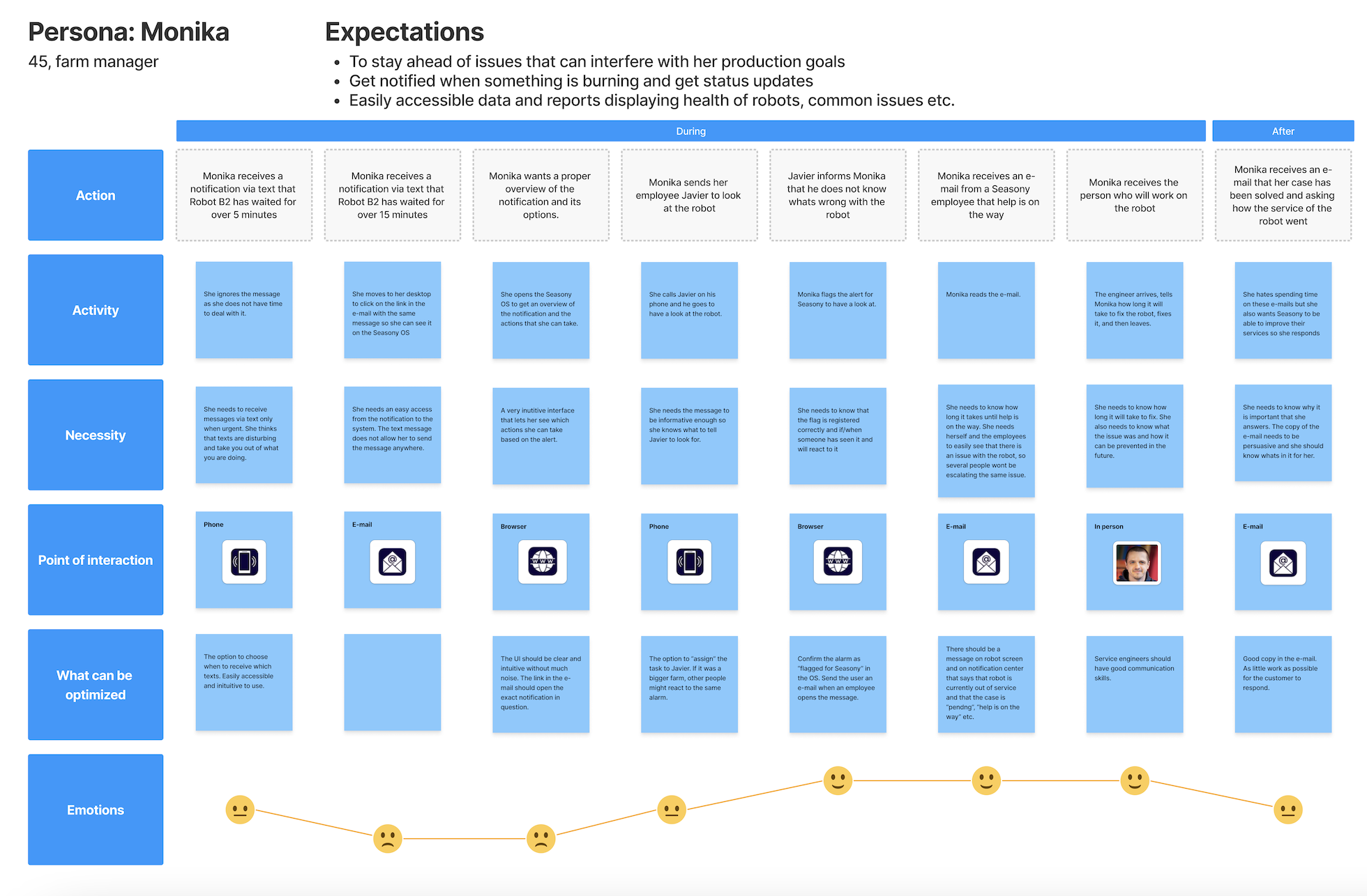
The personas are then used to create customer journeys, for different scenarios. I do this exercise to try to pinpoint any potential pain points, friction areas, or opportunities for improvement within the customer experience.
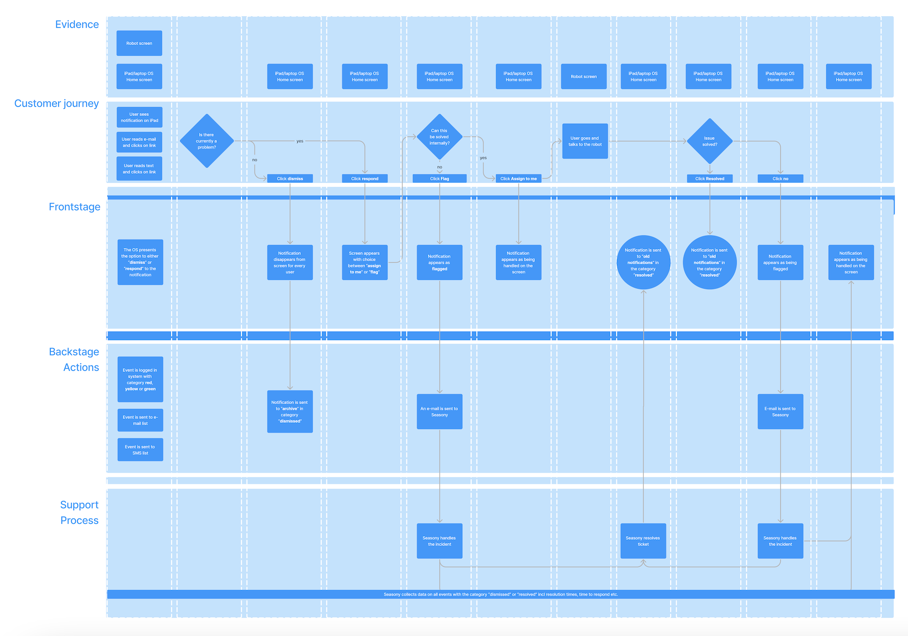
Next in the project, I develop a service blueprint to get an overview of the interplay of internal processes, organizational responsibilities, and customer interactions, which can provide us with more comprehensive insights than the customer journey alone. This approach allows us to understand not only the customer’s perspective but also the operational and structural aspects that impact the overall service delivery.
Design Research
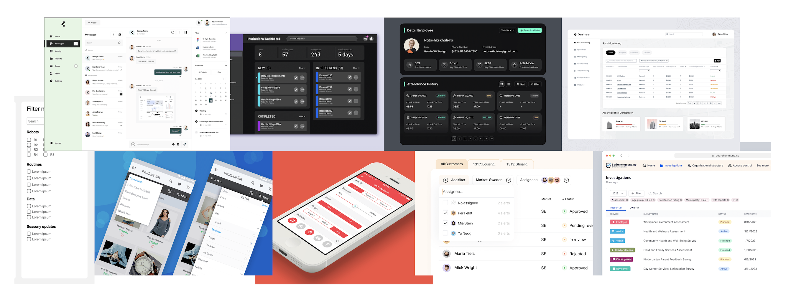
As part of the research phase, I do some design- and pattern research on Dribbble, to see how other designers have solved similar problems in relation to notifications and filtering of notifications. This will help me later when I have to design the notifications in Figma.
Information Architecture
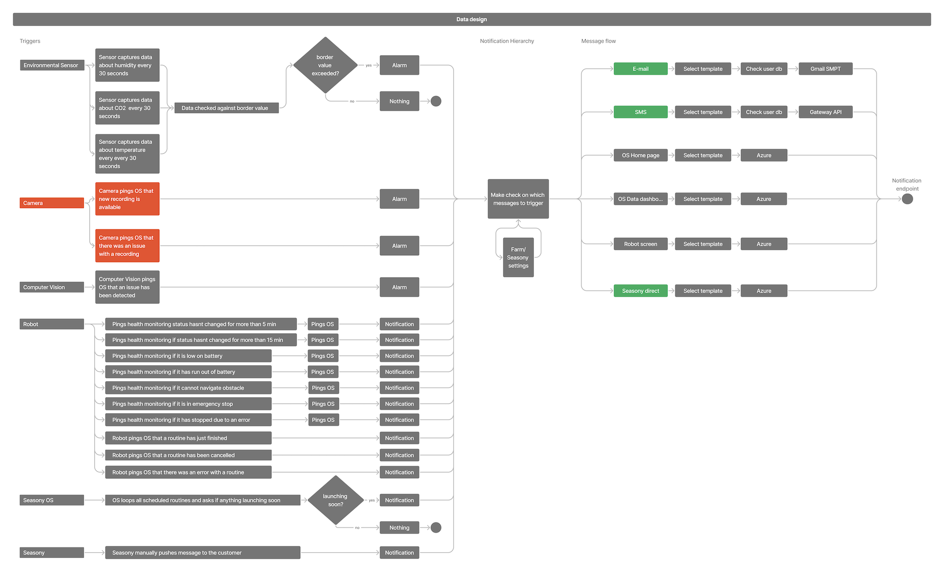
I made a plan for how notification data would be integrated into our system. I made sure to think through all the different aspects and scenarios. To double-check that we didn’t miss anything crucial, I had a meeting with our company’s full-stack developer.
Meanwhile, my colleague explored better ways to send emails from our system. They also researched options for sending text messages and looked into how much it would cost.
UX Writing
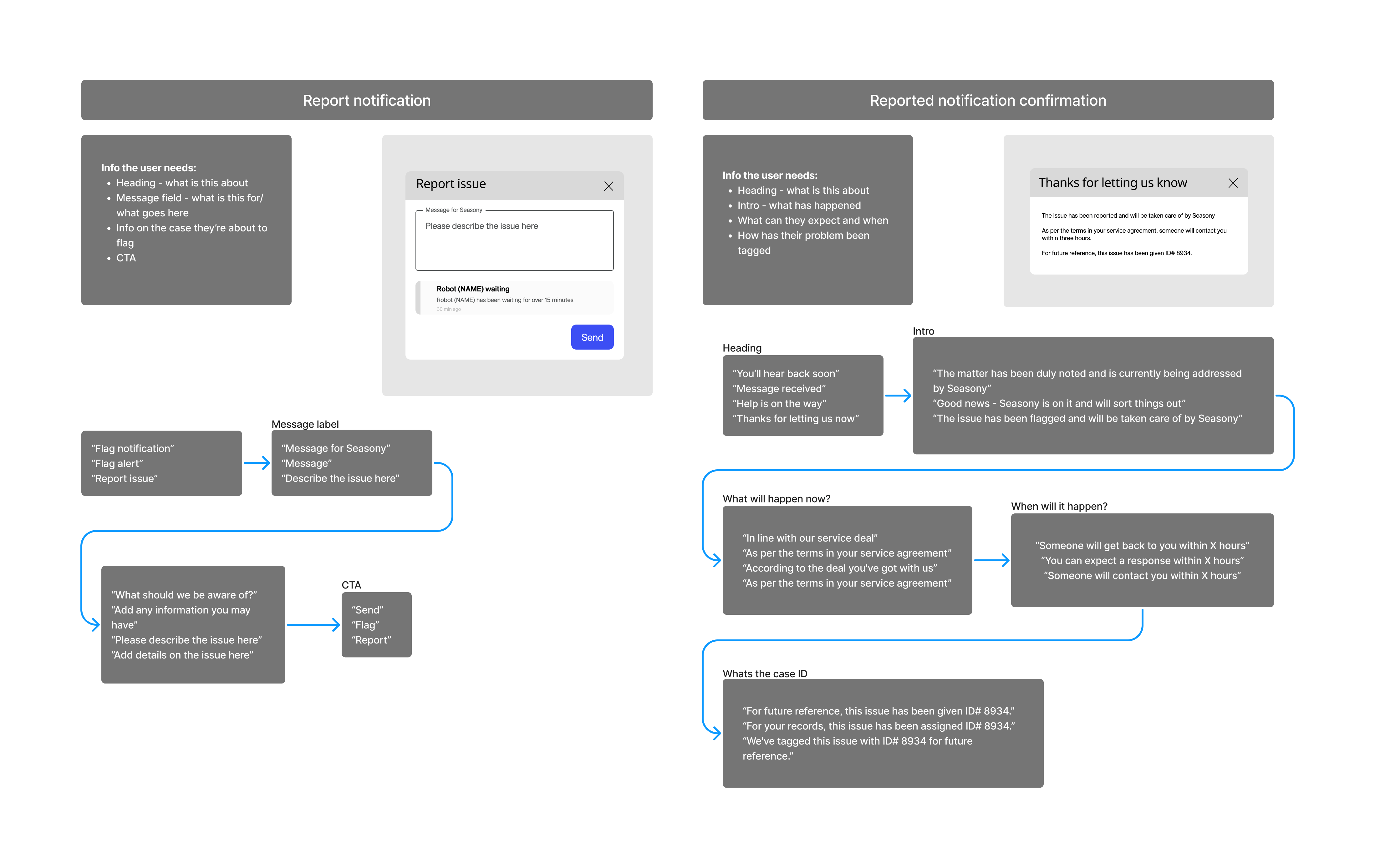
The copywriting and micro copy was an important part of this project.
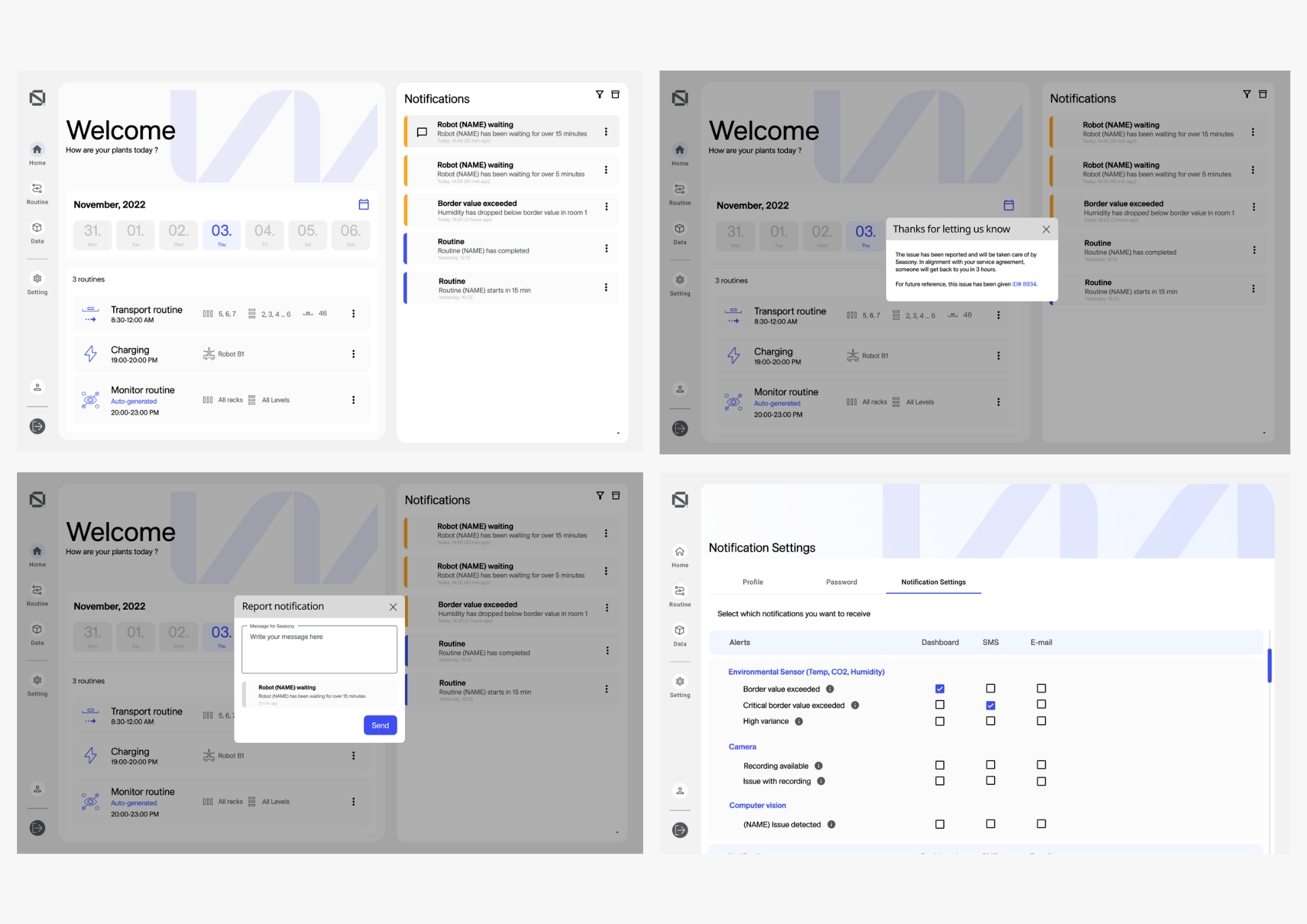
I spent some time coming up with several ways to deliver the same message, testing them amongst the employees and choosing the combinations that were most user friendly. In the above example is the message you get when reporting a notification, and the message you get after reporting.
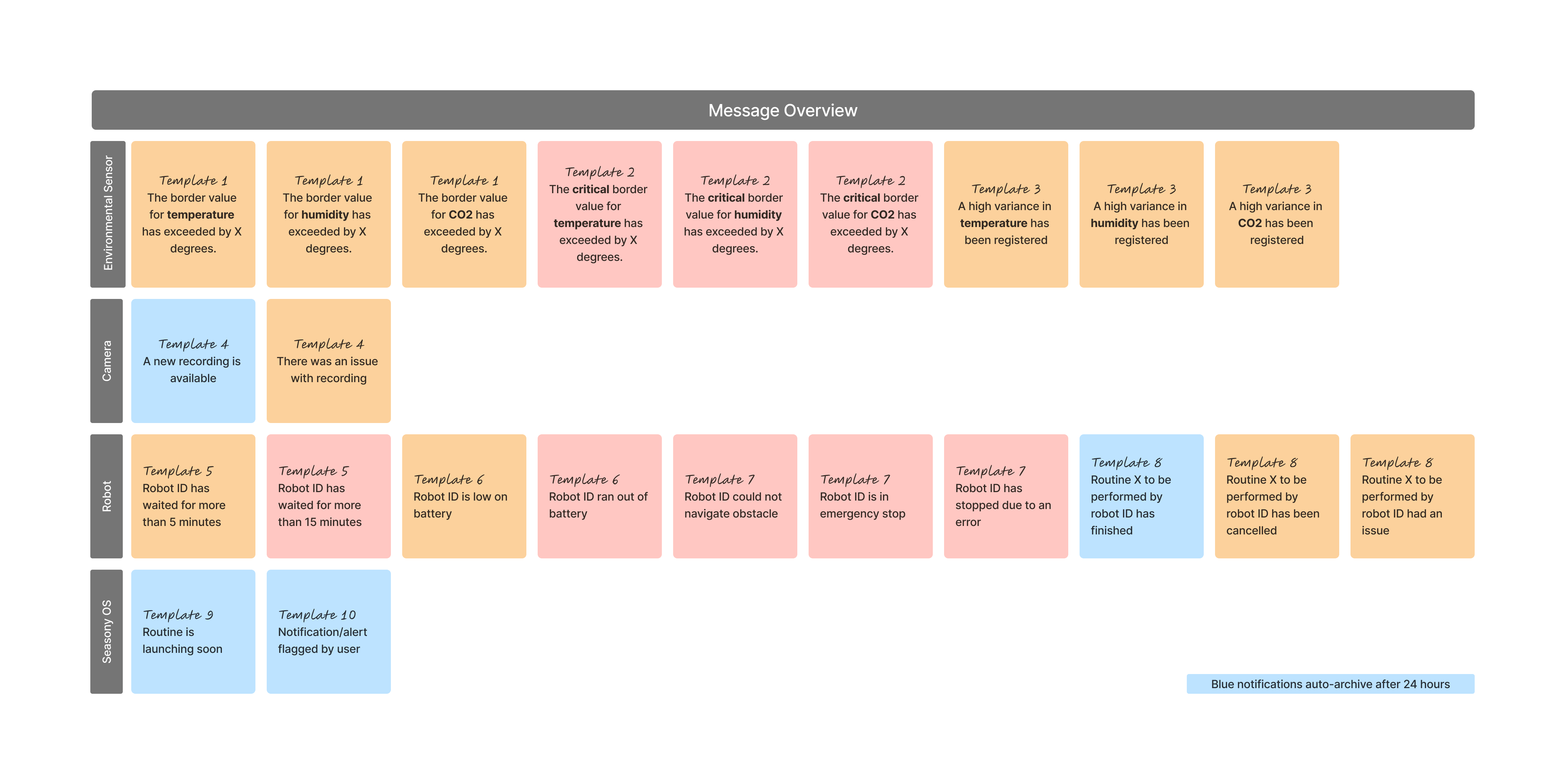
Based on the inforation architecture, I made an overview of the messages we needed to write.
Some of the things we needed to find out at this point:
- Which notifications should auto-archive?
- Which notification type should have which criticality (color code)
- Tone of voice
- What was crucial info for each template type
- Which level of complexity did we want for the templates – how many variables
For each template variant discovered, I made a few different versions of each message, for the channels that were relevant for each specific message. It was decided to have medium complexity of the text (grouping them where it made sense, and having several variants). I then wrote some example messages using the mark-up of each version, making sure that everything made sense when it was actually written out.
Process & Testing
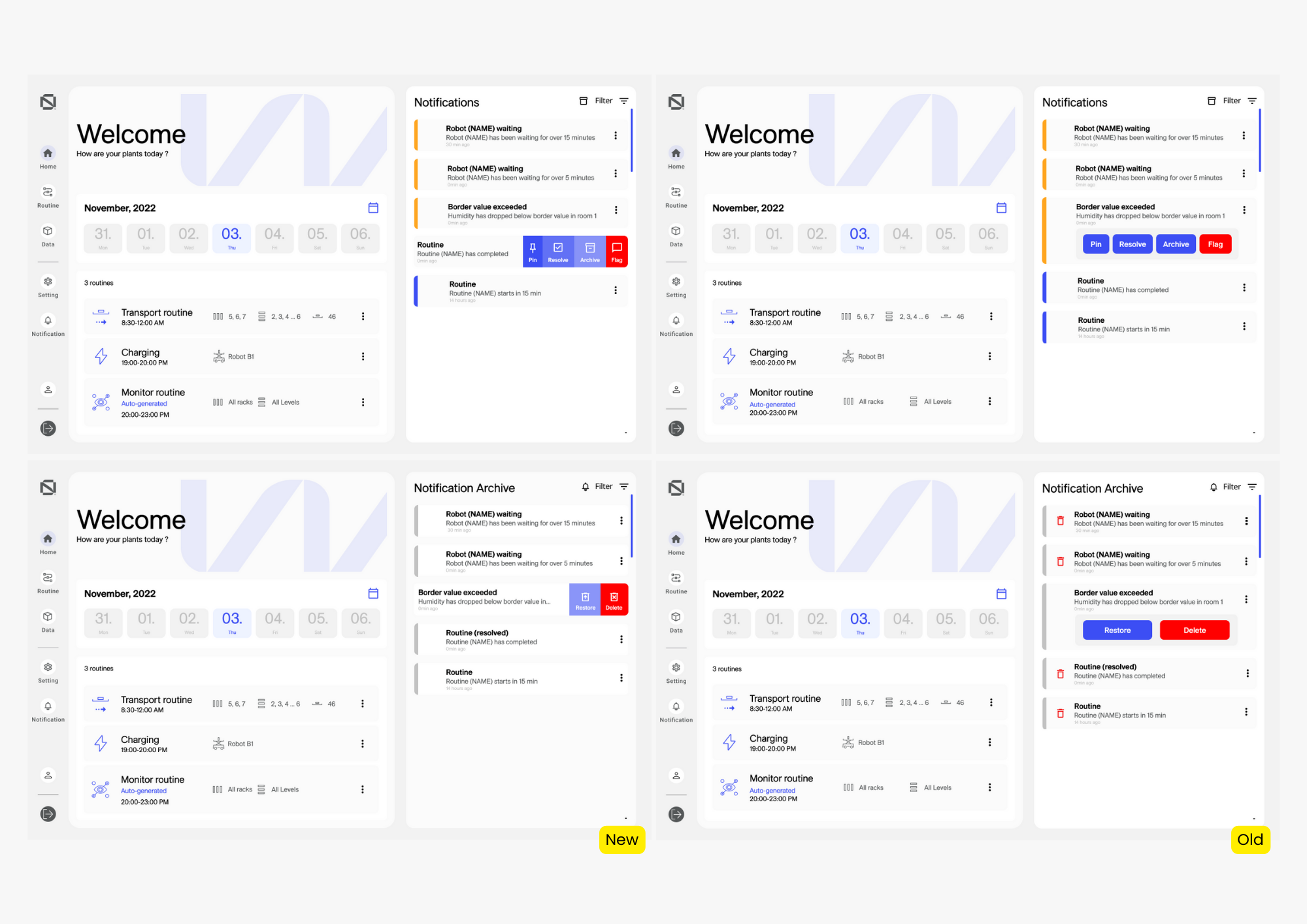
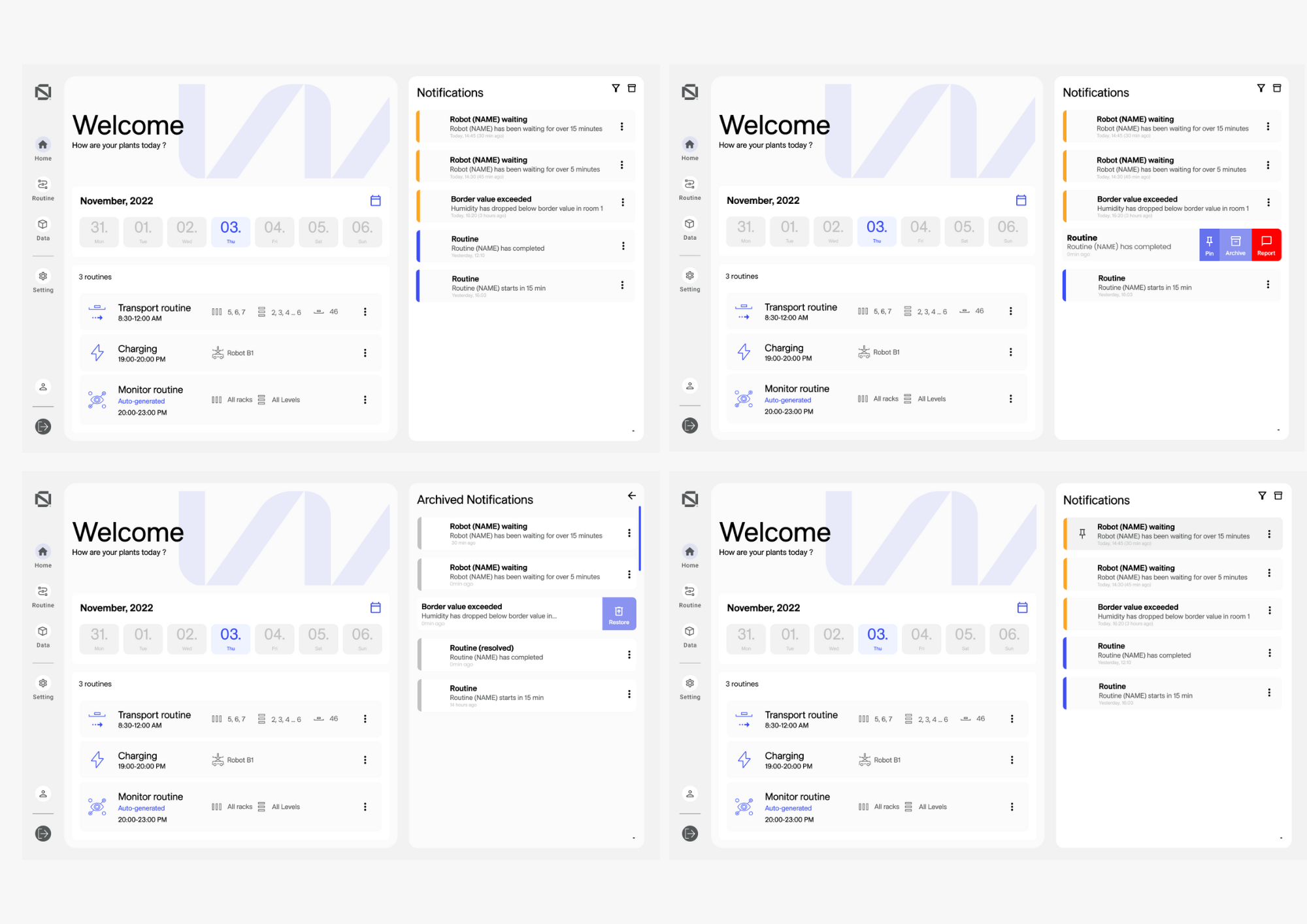
I tried out the system design buttons in the interface. To add a modern touch, I took inspiration from user-friendly interfaces like Google and Hotmail, and their swiping-to-delete feature for emails. I integrated this button style that slides in from the side when clicked, making interactions more visually appealing.
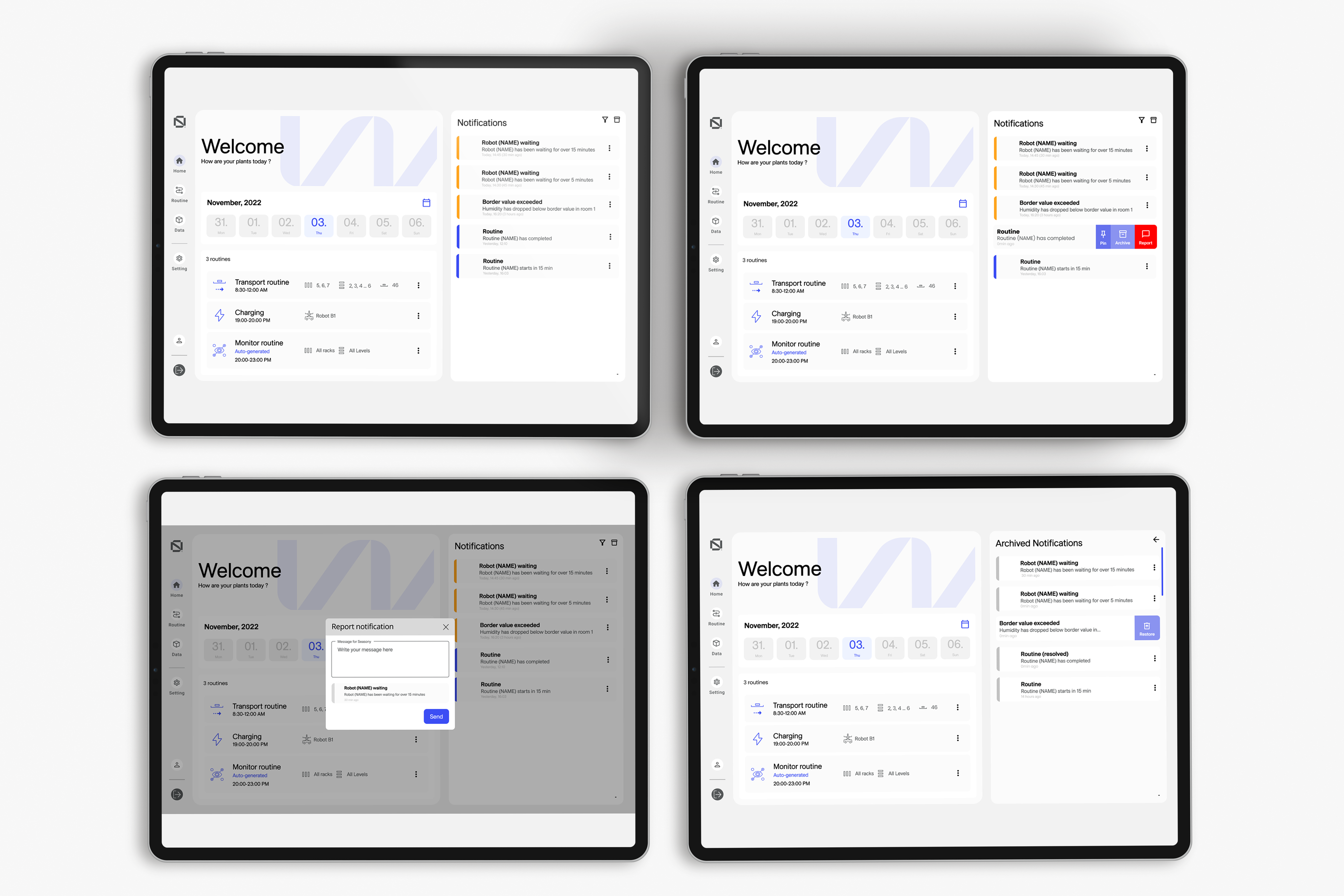
During our discussions, there was a consideration to implement a “swipe” feature for cards in the interface, especially since the project was intended for tablet use. However, we decided against it to ensure compatibility with laptops.
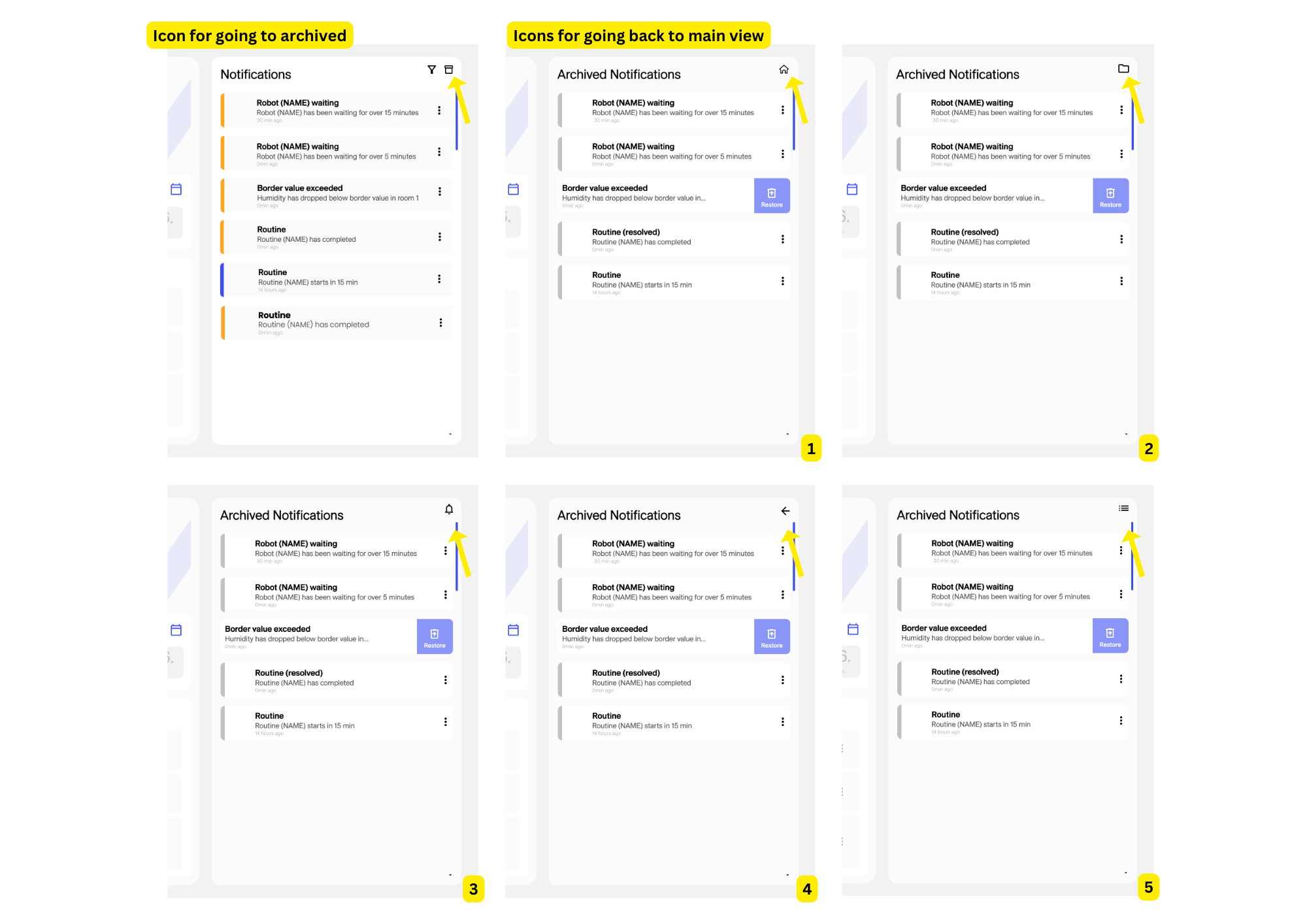
I wasn’t sure about the best way to guide users back to the main notification view after they’ve visited the archive. For that reason I decided to do a test amongst other UX designers, to see which button was more intuitive to them.
Testing with other designers has both benefits and drawbacks. On the positive side, it can bring in fresh ideas from experts in user experience, possibly leading to smart solutions. But it can also be tricky because designers may have their own preferences and biases, which might not always match what regular users prefer. Still, I thought this collaborative approach would help us make a more informed decision.
Final Designs
